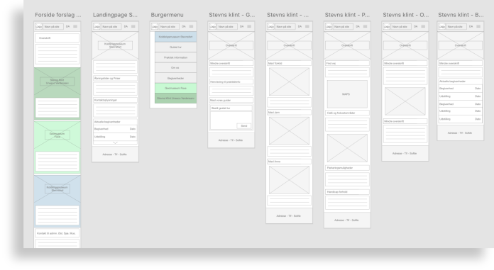
Project6

KEA project: Redesigning the
main website for Kalklandet.

Note: I will be referring to their original website that we were tasked to redesign as their “previous website” because they have since this project updated their site.

about the project.

This was a project we did in the beginning of my multimedia design education. We were given the task to create a new website for kalklandet.dk which is a museum that includes three different attractions. Their previous website was very big and contained a lot of unnecessary information as well as dead links and a confusing structure. We created the new website using Wordpress, HTML and CSS.

In this project our group consisted of four people. We therefore had our individual tasks and responsibilities. My primary task was to set up the site in Wordpress and program it. However in this project the focus was more on the research phase and how we should structure a project. So in this phase everyone in the group was heavily involved in doing the desktop research, site mapping, interviews, card sorting, brainstorming and so on.

Mobirise

the sitemap.

the process and research.

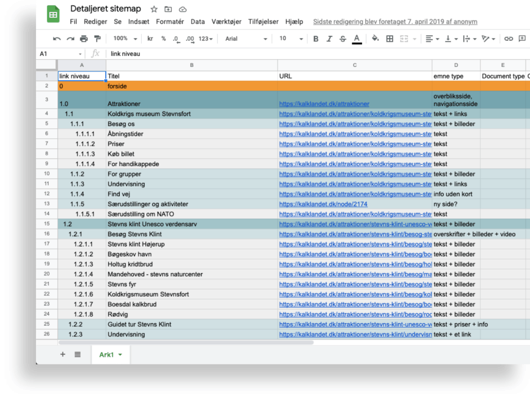
To begin the structuring of their previous website we had to make a sitemap manually. To do this we set up an excel document and began going through the website. We had to do it manually for the sake of learning the process, however if I had to do it again today I would definitely use a sitemap-generator tool such as xml-sitemaps.com.

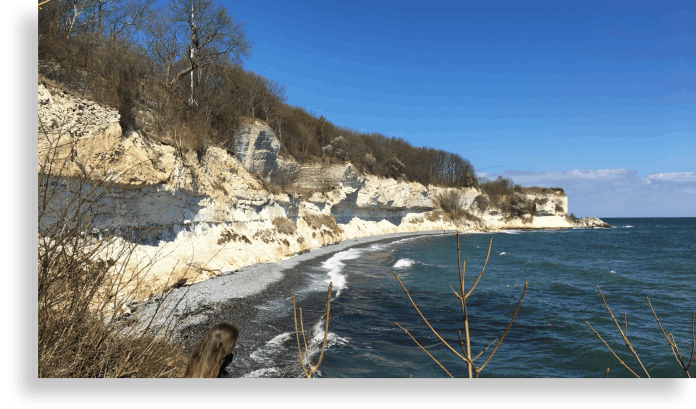
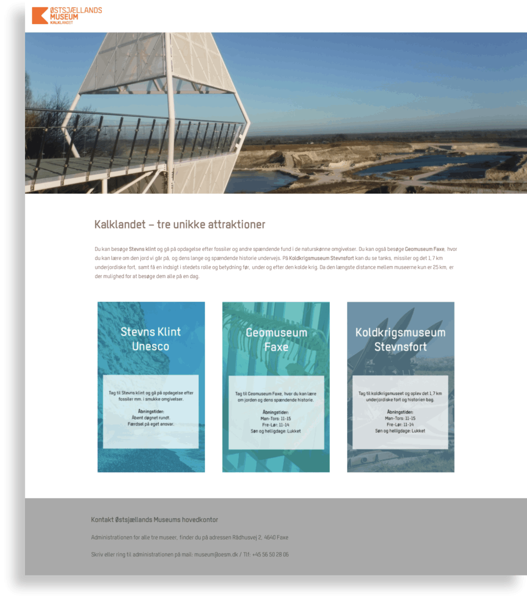
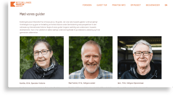
In our group we decided to go and do some proper field research, so we took a day trip down to the museum and had an interview with one of the guides. While we walked around we took pictures for the website.

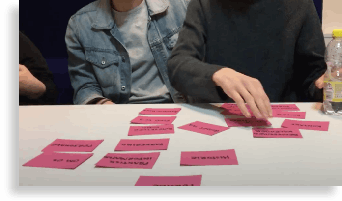
In the process of creating the new structure and information architecture for the website we did some card sorting to help us figure out how we could make a user friendly interface. Afterwards we began working on the design. 

visiting the sights (Stevns Klint).
cardsorting.
Mobirise

final landingpage.

the design.

To begin this process we made some wireframes for how the layout would look on both desktop and mobile. For this we used the program Adobe XD, where we also made the more developed versions of our mock-ups. We wanted to simplify the website and make it more understandable that there are three different attractions under the one name “Kalklandet”. The landing page therefore contained a short explanation and then a link to each of the three attractions which then have an individual site. We wanted to keep the colours of their previous site so it would match the orange logo and be recognizable and otherwise divide the three attractions into individual colours as well.

Please note that the website was never fully completed so some elements aren’t clickable and it is only one of the attractions that have content. Therefore you should click on “Koldkrigsmuseum Stevnsfort” when on the landing page.


See the final website by clicking here.

wireframes of the site (mobile version).
a page on the site – our tourguide was the man on the right.

majroslynglarsen@gmail.com
 
+45 29 45 74 97

Site was designed with Mobirise