Exam project: Creating a
website for Ninna York.
This was the project my group and I did for our second semester multimedia design exam at KEA. The framework of the assignment was to create a digital product using Wordpress, for a person or company in the artist-industry. We chose the jewelry artist and smith, Ninna York. We created a website through Wordpress after a thorough conversation with Ninna about her needs and wishes. The goal for this project was to create a more androgynes looking website, where the user would get an interesting and creative experience, different from any other online jewelry store.
In this project our group consisted of three people. We therefore had our individual tasks and responsibilities. Mine was primarily to program the website by setting it up in Wordpress and writing the code. However everyone in the group pitched in on brainstorms and all opinions were considered throughout the entire process.
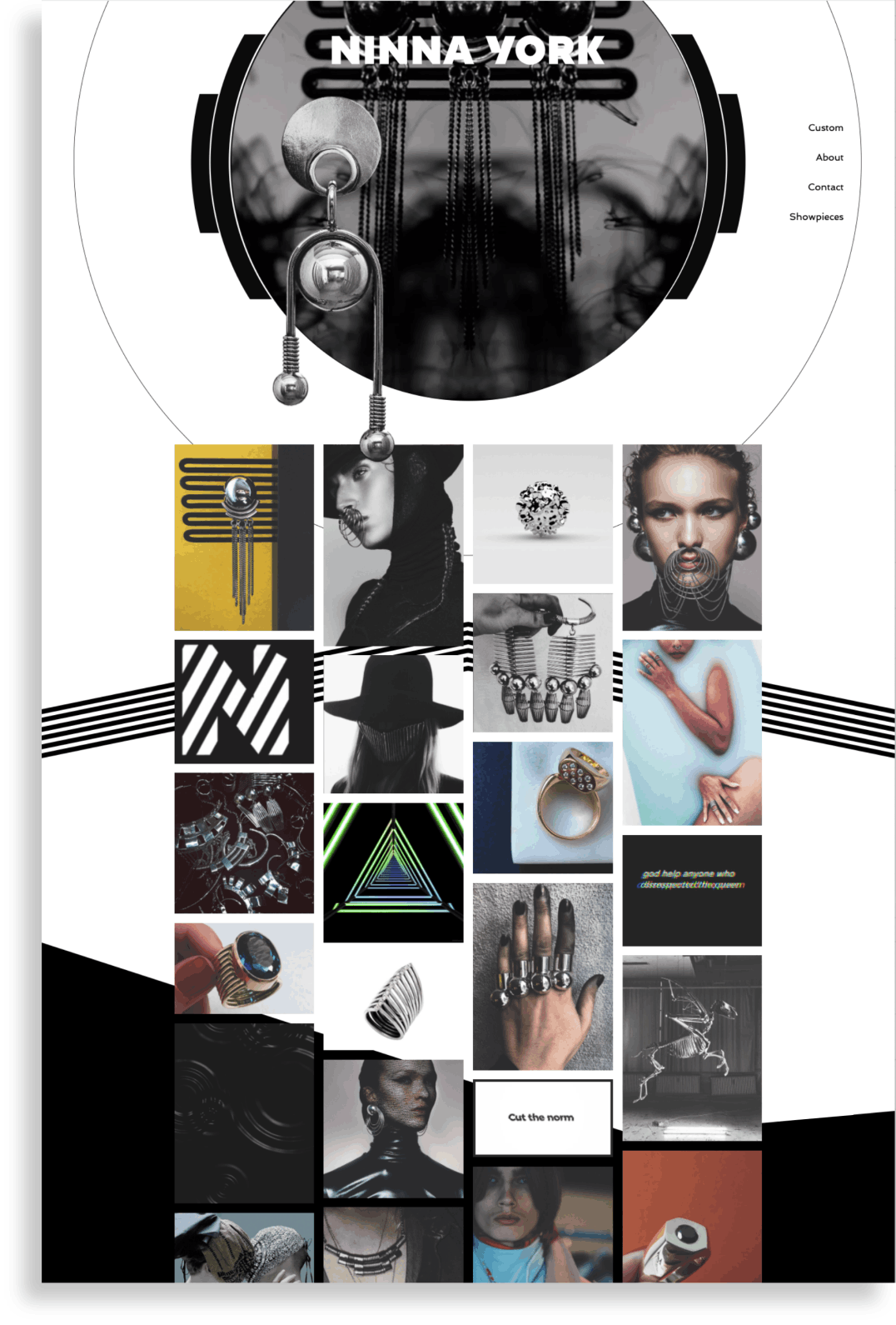
final landingpage.
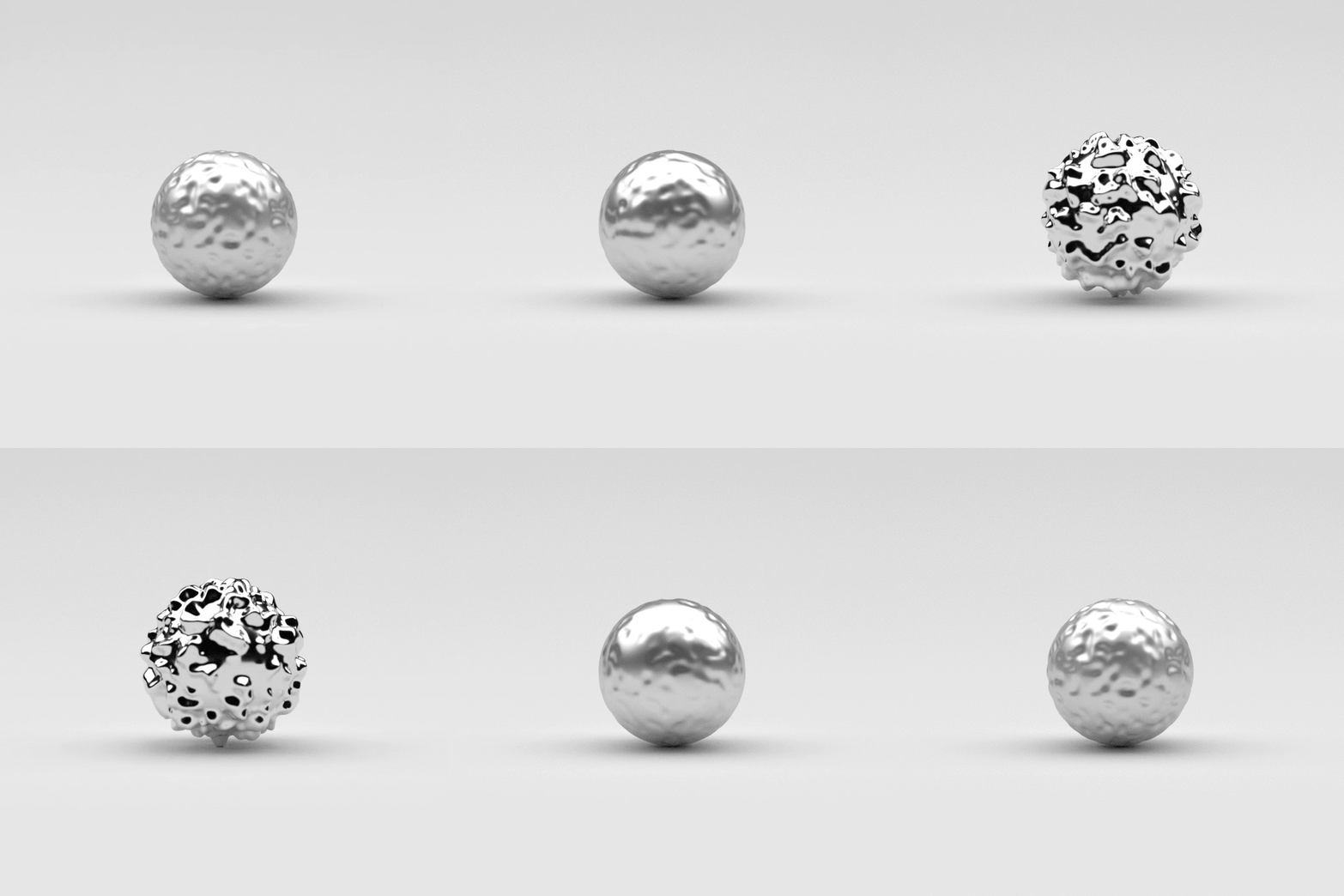
From the brief we got from the client, Ninna, it was clear which direction she wanted to go. She didn’t want the site to be too stiff and boring – but more different and alive. We therefore created a landingpage that resembles the explore page on Instagram. The feed consists of images of showpieces, nature, jewelry and gifs – all to create an alive and artistic feeling. The gifs in particular (example below) gives the feed movement and life. For the color scheme, we wanted something bold, but simpel so we chose black and white. This makes a statement, but doesn’t steal focus from the images.
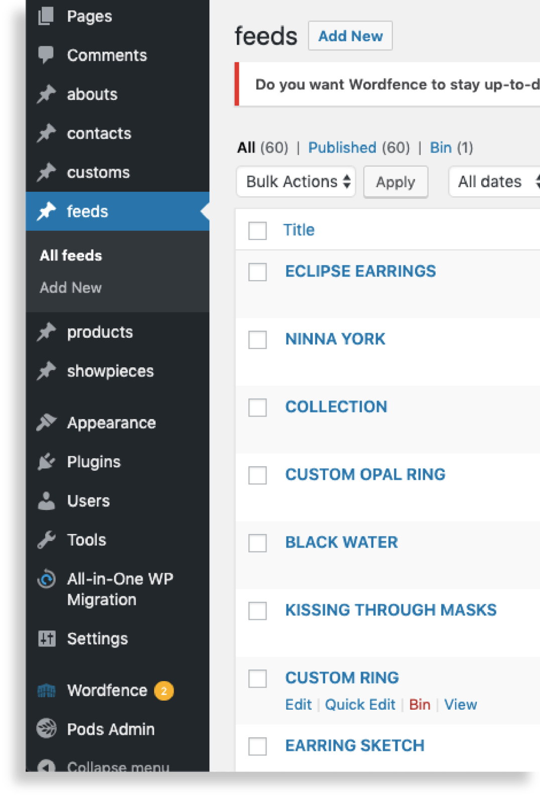
the content in Wordpress.
As for the programming of the site, we were required to set it up using Wordpress. This made sense to do anyway because the client needed easy access to frequently upload new images and jewelry to the site. We used HTML, CSS and Javascript to build the appearance and functions of the site, and REST API to create a dynamic site so the client can upload content through Wordpress. To get the uploaded content on to the site, we fetched a json file in the code in Brackets. In order to get the feed of images on the landing page in the correct way, we went through a couple of tries before getting it right. In the end we used a piece of code called “Column-count” which divides text and images into columns. With this, the images would place themselves vertically instead of horizontally. This was positive because it meant that older images would reappear in the top row, as new images got uploaded, and therefore possibly be rediscovered instead of forgotten in the bottom.
See the final website by clicking here.